
Navigation bars are incredibly important for a website’s success.
It is the element that allows users to access the content they need, and if it’s not designed properly, 37% of users say they will leave the site.
Navigation bar design should be tailored to meet the objectives of your website’s objectives and provide an intuitive user experience.
In this guide, we will cover how to design a navigation bar for a website, from considering user needs to best practices for implementation.
What is a Navigation Bar?
A navigation bar is an essential element of any website.
The menu appears at the top, bottom or side of a website and helps users find their way around.
Navigation bars typically include links to all the important pages on a site, such as the home page, about us page, contact us page, and any other relevant sections.
And often displayed prominently on a website because it plays such an important role in helping visitors find what they are looking for.
In a nutshell: To design a great navigation bar, you need to consider several factors.
First, you must ensure that your navigation bar is clear and easy to understand.
This means using simple language and avoiding jargon or technical terms that might confuse users.
You also want to make sure that your navigation bar is visually appealing so that it stands out from other elements of your website.
In addition to these design considerations, you should think carefully about the structure of your navigation bar.
Ideally, you want to keep things organized so that users can quickly find what they are looking for without searching through lots of irrelevant content.
This may mean grouping similar pages together or creating sub-menus for more complex sites with lots of different sections or categories.
Paying attention to these details when designing your navigation bar can help ensure users have a great experience when visiting your site.
Benefits of a Navigation Bar: Reasons You Need One
There are several benefits to having a navigation bar on your website.
First, it makes it easier for users to find what they are looking for.
With a clear and organized navigation bar, visitors can quickly locate the information they need without digging through multiple pages.
Secondly, having a well-designed navigation bar can increase user engagement and reduce bounce rates.
If visitors can easily find what they’re looking for, they’re more likely to spend more time exploring your site.
Lastly, including links in your navigation menu that lead back to other pages on your own website (internal linking) helps improve SEO by making it easier for search engines like Google or Bing to crawl and index all of your content.
This ensures you have better visibility online, leading to higher traffic volumes and ultimately more sales or conversions.
Types of Navigation Bars
As you might have already realized, there are different ways to create navigation for your website.
And each has its up and downsides.
a. Horizontal Navigation Bar
A horizontal navigation bar is one of the most common types of website navigation.
It’s easy to use, intuitive, and doesn’t take up too much space on a page.
To create an effective horizontal navigation bar, you need to consider the number of items you want to include.
If you have many menu items, it can be difficult to fit them all onto one line without making the font size too small or cluttering the page.
In this case, it may be better to use drop-down menus or submenus to organize your content.
When designing your horizontal navigation bar, ensure each item is descriptive and easy to understand.
Avoid using jargon or complex terms that might confuse visitors. Instead, use simple language and clear labels that accurately describe what each section of your site contains.
This will help users quickly find what they’re looking for and easily navigate your site.
Pros:
- Easy to implement and maintain.
- Easily visible on any screen size or device.
- Allows users to quickly identify where they are in the website’s navigation structure.
- Provides direct access to major pages of a website without having to scroll down a page.
- Enhances the user experience by utilizing more natural scanning patterns such as left-to-right and top-to-bottom reading habits.
Cons:
- Limited space for navigation items which can lead to overcrowding if too many links are included in the horizontal bar.
- Can be difficult to read when text labels are long due to limited space available in the navigation bar width-wise.
- Can take up valuable real estate on mobile devices, leaving less room for page content and making it harder for users to find what they need quickly on small screens.
- It is unsuitable for websites with many pages, as it can be difficult to fit all the links into the navigation bar.
b. Vertical Navigation Bar
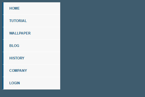
A vertical navigation bar is a popular choice for websites with a lot of content.
It’s an efficient way to keep site visitors on the same page while they navigate through your website.
The vertical orientation allows you to display more options in less space, which can be especially useful for mobile users.
This type of navigation can also help organize content by grouping related pages together.
When designing a vertical navigation bar, consider the user experience.
Make sure that the menu is easy to read and understand, with clear labels that accurately describe each section or page.
Consistency is key when it comes to placement and design, so make sure each menu item has the same formatting and positioning throughout your entire website.
Another important aspect of designing a vertical navigation bar is its responsiveness across different devices.
Ensure your menu works well on desktop and mobile screens by testing it thoroughly before launching your website live.
Pros:
- It is a great way to save screen space and make efficient use of the website’s real estate.
- Provides an organized view of the web page, making it easier to find content quickly.
- It provides better access to deeper pages in the website, helping with search engine optimization (SEO).
- Very easy to use and understand, even for novice users.
- Can provide visual cues when hovering over links or submenu items, allowing for easier navigation and discovery of content.
Cons:
- Can be challenging for visitors to find what they are looking for if there are too many categorization levels within the navigation bar.
- Not as flexible as other navigation options such as horizontal menus or fly-outs which can display more information in less room and allow for dynamic changes in the menu structure as needed .
- Can be difficult to customize and update, particularly when dealing with a large number of navigation items.
- Can be difficult to make the navigation bar look aesthetically pleasing and fit in with the overall website design.
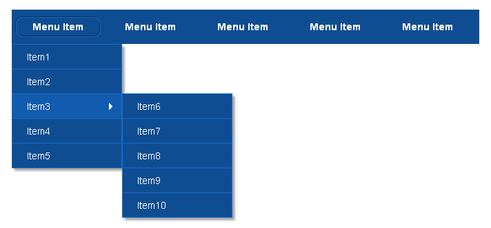
c. Drop-down Navigation Bar
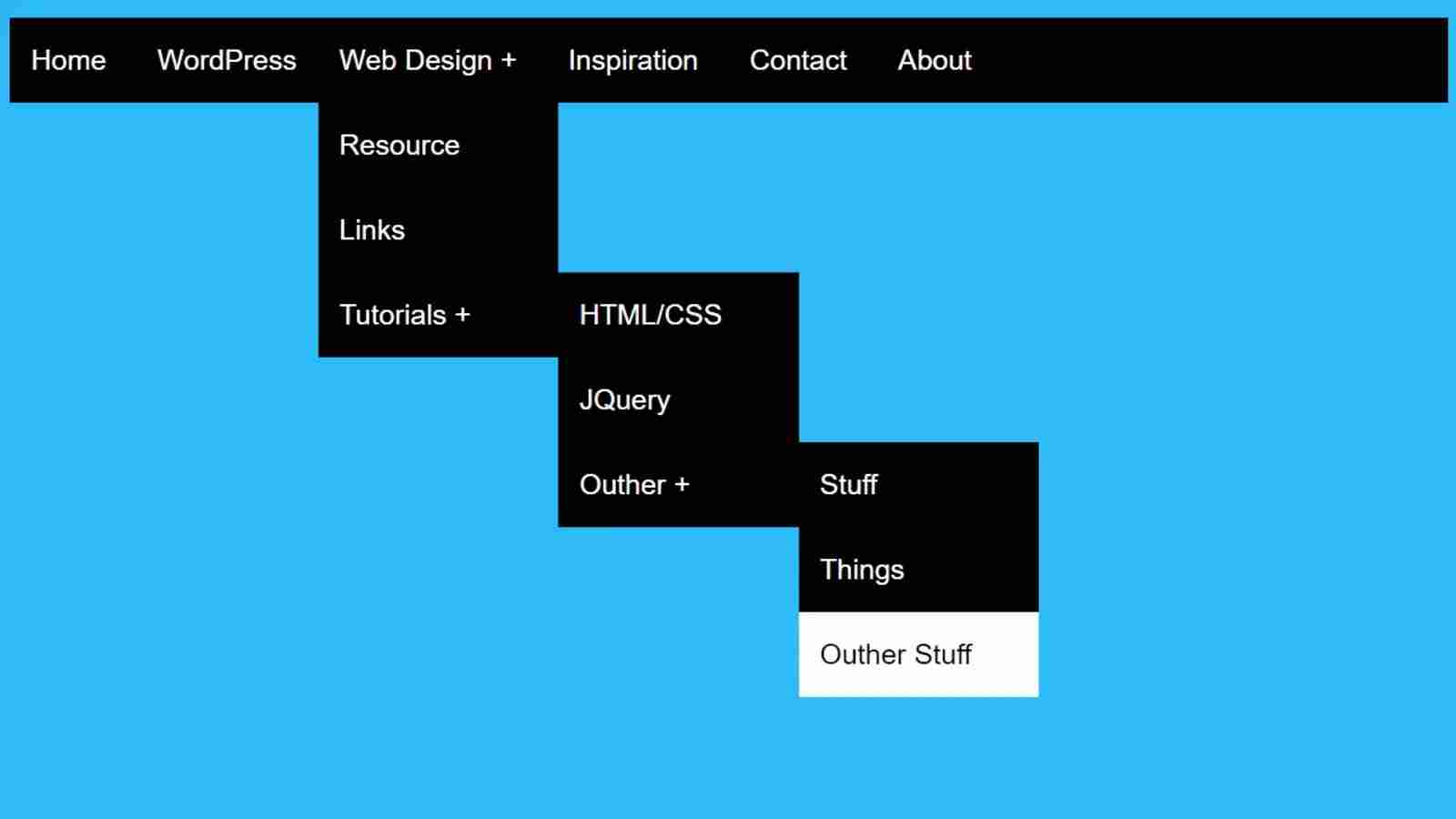
When it comes to website navigation, a drop-down menu can be a great way to organize your content and make it easily accessible for visitors.
A drop-down navigation bar can enable you to display multiple levels of content on your website without cluttering up the main navigation bar.
One important aspect of creating a drop-down menu is ensuring that it is easy to use and navigate.
Be sure to label each main category clearly so that users know where they are headed. Include subcategories as well, but only if they are necessary and relevant.
It’s also essential that the drop-down menu loads quickly and works seamlessly across all devices, including desktops, tablets, and mobile phones.
Ensure that any links within the dropdown menus are working correctly, and test thoroughly before launching your website with this feature.
Pros:
- Easy to access and use – drop-down navigation bars are easy to interact with and require minimal effort from users.
- Low barrier of entry – they require no special technical or design knowledge, making them accessible to all users.
- Quick navigation – the drop down menu allows for quick access to content by providing an overview of the site’s structure in one place.
- Customizable – Drop-down menus can be customized with different colors and fonts that best match a site’s design language.
- Space saving – Unlike other navigation forms, drop-downs take up less space on a page as they are hidden until the user activates them.
Cons:
- Usability issues – users may struggle with finding the right category in the menu, which can lead to frustration when navigating the website.
- Not mobile friendly – due to their large size and complex structures, drop-down menus may not be optimized for mobile devices.
- Limited to one level of navigation – drop-down menus are limited to one level of navigation, so they cannot be used to create multi-level navigation structures.
- Overwhelming – if the drop-down menu has too many options, it can be overwhelming and difficult to use.
- Unintuitive – drop-down menus are not as intuitive as other forms of navigation, so users may have difficulty understanding how to use them.
d. Breadcrumb Navigation Bar
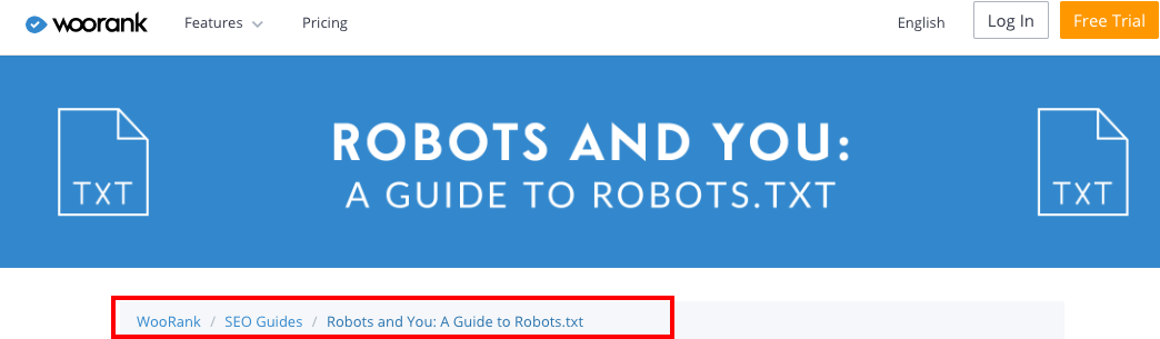
A breadcrumb navigation bar is a type of secondary navigation that helps users keep track of their location on a website.
It consists of a series of links that show the user where they are in relation to the homepage and other pages on the site.
Breadcrumb navigation can be especially useful for websites with deep hierarchies, such as e-commerce sites with many categories and subcategories.
When designing a breadcrumb navigation bar, keep it simple and easy to use.
The links should be clear and concise, using familiar language that users will understand.
It’s also important to make sure the breadcrumb trail is consistent across all pages on the site, so users can always find their way back to where they started.
When designing your breadcrumb navigation, one thing to consider is how it will look on mobile devices.
With more and more people accessing websites from their phones and tablets, it’s essential that your navigation works well on smaller screens.
One solution is to use responsive design techniques that adjust the layout of your site based on screen size, ensuring your breadcrumb trail remains accessible no matter what device someone is using.
Pros:
- Easy to follow and understand where you are in the website’s hierarchy.
- Allows for easy retracing of steps when navigating the site.
- Space efficient for navigation links compared to other forms of navigation.
- Reduces reliance on the back button and provides a better user experience.
- Increases pageviews as users can quickly jump between related pages without reloading the entire page each time.
Cons:
- It can clutter up the interface if too many levels or categories are included in the navigation bar.
- Too many breadcrumbs can be overwhelming and confusing for users who don’t understand what they mean or how to use them correctly.
- Maintenance of this type of navigation structure can be difficult, especially when new content is added or existing content changed frequently on a website or application .
- Not all devices support breadcrumb navigation, making it sometimes difficult to use.
- Breadcrumb navigation can take up considerable space on a page, which can be an issue when space is limited.
Related: What’s The Best Way To Create A Website
Navigation Bar Design Principles
Now that you know the types available, there are some guidelines to follow before you sit down and create.
1. Usability
Usability is a crucial aspect to consider when designing a navigation bar for your website.
A well-designed navigation bar should be easy to use and understand, allowing users to quickly navigate your site.
How can you abide by this?
Start by keeping the navigation simple and straightforward, with clear labels that accurately represent the content of each page.
Next is the placement of the navigation bar.
Ideally, it should be located at the top of the page where users will naturally look for it. It’s also beneficial to ensure that your navigation remains visible and easily accessible as users scroll down the page.
Finally, make sure your navigation bar is responsive and mobile-friendly.
As more people access websites on their mobile devices, it’s essential that your site can adapt accordingly.
Test your design on different screen sizes to ensure that all elements are legible and easy to use on any device.
Usability principle is there to help create a user-friendly experience that keeps visitors engaged for longer periods of time.
2. Accessibility
To ensure that all users can easily navigate the website, designers must consider factors such as color contrast, font size, and keyboard accessibility.
The color contrast between the text and background should be high enough to make reading easy for people with visual impairments.
The font size should also be large enough to avoid straining the eyes of users with visual difficulties.
Keyboard accessibility is also important for those who cannot use a mouse or trackpad to navigate through the website.
Ensure that all navigation elements can be accessed using only the keyboard, such as by pressing tab to move from one link to another.
This not only helps those with disabilities but can also improve overall user experience by making it easier and faster for everyone to navigate.
In addition, keep in mind that some users may require assistive technologies such as screen readers or voice commands.
Navigation labels must be clear and concise to accurately describe these technologies to users who rely on them.
Like usability principle, accessibility is here to create an inclusive user experience that benefits all visitors to the website.
3. Visual Design
When designing a navigation bar for a website, visual design plays a crucial role in making it easy to use and visually appealing.
First and foremost, the size of the navigation bar should be proportional to the website’s overall design.
It should be easily visible but not overpowering or distracting from other important elements on the page.
Another important consideration is color.
The colors used in the navigation bar should complement the overall color scheme of the website while still standing out enough to draw attention.
Consistency is key when it comes to color – using consistent colors throughout different pages will help create a cohesive and unified look for your website.
Finally, typography is another crucial element in creating an effective navigation bar.
Fonts should be legible and easy to read, even at smaller sizes.
Choosing a font that complements your brand identity can also help reinforce your message and make your site more memorable for visitors.
This is your chance to create a visually appealing navigation bar that helps ease users through their journey on the site.
How To Implement a Navigation Bar
Time to roll your sleeves and get to work.
Here are some ways to create a navigation bar for your website.
a. Using HTML & CSS
For this to work, you need to have a good understanding of HTML and CSS.
HTML provides the structure and content of the page, while CSS is responsible for styling and layout.
You’ll need to use the <nav> element to create a navigation bar using HTML.
Inside this element, you can create links using the <a> element.
You can also add classes or IDs to these elements to target them with CSS.
Here’s a code example:
<nav class="nav-bar">
  <ul>
    <li><a href="#">Home</a></li>
    <li><a href="#">About</a></li>
    <li><a href="#">Contact</a></li>
  </ul>
</nav>
In this example, the nav element defines a section of the page as the navigation bar.
The <ul> element is an unordered list that contains the navigation links, and each <li> element represents a single item in the list.
The a element inside each <li> element creates a hyperlink to the corresponding page.
You can add more items to the list by adding additional li elements inside the ul element.
You can also style the navigation bar with CSS to customize its appearance.
Once you have your HTML in place, you can use CSS to style your navigation bar.
This includes setting properties like font size, color, padding, and margins.
You may also want to add hover effects or animations to make your navigation more engaging for users.
Example of CSS styles for this nav bar
.nav-bar {
  background-color: #333;
  overflow: hidden;
}

.nav-bar ul {
  margin: 0;
  padding: 0;
  list-style-type: none;
}

.nav-bar li {
  float: left;
}

.nav-bar li a {
  display: block;
  color: white;
  text-align: center;
  padding: 14px 16px;
  text-decoration: none;
}

.nav-bar li a:hover {
  background-color: #111;
}
This CSS code applies the following styles to the nav-bar:
- Sets the background color to dark gray (#333) and sets overflow: hidden to ensure the navigation bar doesn’t overflow its container.
- Sets the margins and padding of the unordered list (ul) to 0 and removes the bullet points using list-style-type: none.
- Floats each list item (li) to the left so they are displayed horizontally.
- Styles each hyperlink (a) inside a list item with a white text color, centered text alignment, and padding on the top and bottom (14 pixels) and left and right (16 pixels).
- When the user hovers over a link, changes the background color to black (#111).
With some knowledge of HTML and CSS, creating a well-designed navigation bar is within reach for any web designer or developer.
b. JavaScript & jQuery
Once you are done creating a navigation bar using HTML and CSS, you’ll see something.
It just sits there and doesn’t do anything.
In short, it had no interactivity.
How do you solve this?
JavaScript and jQuery are essential tools for creating dynamic and interactive navigation bars on websites.
JavaScript is a programming language that runs in the browser, allowing web designers to add complex functionality to their site’s navigation.
With JS, designers can create dropdown menus, hover effects, and other interactive elements that enhance the user experience.
jQuery is a popular JavaScript library that simplifies the code writing process for web developers.
It provides pre-written code for common functions such as animations, event handling, and AJAX requests.
This makes it easier for designers to create dynamic navigation bars without having to write all of the code from scratch.
Together, JavaScript and jQuery can be used to design elegant and functional navigation bars that work seamlessly with the rest of a website’s design.
Example of JS and jQuery code
$(document).ready(function() {
  $('.nav-bar li').click(function() {
    $('.nav-bar li').removeClass('active');
    $(this).addClass('active');
  });
});
In this code, we’re using jQuery to add a click event listener to each list item (li) in the nav-bar.
When a list item is clicked, we’re removing the active class from all list items in the navigation bar, and then adding the active class to the clicked list item.
To make this work, you’ll need to add the `active` class to the CSS code we wrote earlier:
.nav-bar li.active a {
  background-color: #4CAF50;
  color: white;
}
This CSS code applies a green background color and white text color to the hyperlink inside the active list item.
You can adjust these styles to fit your design.
With this code, when a user clicks on a navigation link, it will be highlighted with the active class, giving the user feedback on which page they are currently on.
c. Using a Plugin
If you aren’t comfortable with touching, this is your option.
Using a plugin is an easy and efficient way to design a navigation bar for your website.
And works best with CMS like WordPress.
There are several plugins available that can help you create a customized and user-friendly navigation menu.
One such plugin is the WP Mega Menu Pro, which allows you to add icons, images, and multiple columns to your menu items.
Steps to download and Install plugins
- Purchase the WP Mega Menu Pro plugin from a reputable source.
- Log in to your WordPress dashboard.
- Click on the “Plugins” option from the menu on the left-hand side of the screen.
- Click on the “Add New” button at the top of the page.
- Click on the “Upload Plugin” button at the top of the page.
- Select the plugin ZIP file from your computer and click “Install Now.”
- Once the plugin is installed, click the “Activate” button to activate it.
- After activating the plugin, go to the “Appearance” option in the WordPress dashboard and select “Menus.”
- Select the menu you want to edit or create a new one.
- Click on the “Mega Menu Settings” tab.
- Click the “Enable Mega Menu” checkbox to enable the mega menu feature.
- Configure the settings as per your requirements, such as the number of columns, width of columns, and more.
- Save the changes by clicking the “Save Menu” button.
- Preview the menu to ensure that it looks the way you want it to.
That’s it!
The WP Mega Menu Pro plugin is now installed and activated on your WordPress site.
Another popular plugin is UberMenu, which offers various customization options like background colors, font styles, and animations.
It also comes with pre-designed templates that you can choose from or customize according to your needs.
Using these plugins ensures that your navigation bar stands out and provides an excellent user experience.
However, keep in mind that using too many plugins can slow down your website’s loading time.
So make sure not to overload it with unnecessary plugins and features.
Choose only those essential plugins for providing the best user experience on your website while keeping its performance intact.
d. Edit Navigation on OLITT
If you created a website using OLITT, here’s how to edit your navigation.

Double-click on the item.
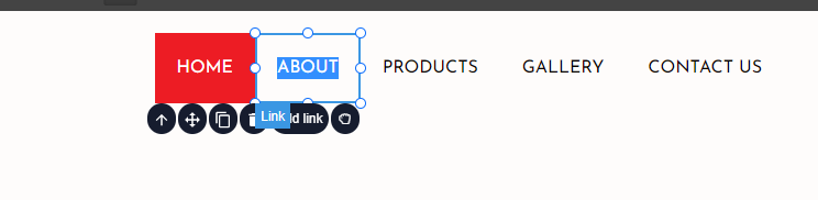
And then change it to anything you want.

Then click on Add link to change the link destination.
What To Do Next
Now that you have designed the navigation bar for your website, it is important to make sure it functions properly.
Test the navigation on different browsers to ensure that it is compatible with all of them.
You can also test its functionality on a mobile device to ensure that it is responsive and easy to use.
One good practice is to label each section clearly and concisely so that users understand what they will find when clicking on them.
Try not to overload your navigation bar with too many categories, as this can cause confusion for users.
Instead, prioritize the most important pages and categorize them accordingly.
Finally, make sure your navigation bar stands out from the rest of the page by using contrasting colors or bold fonts.
This will help draw attention and make it easier for users to navigate through your site.
With these tips in mind, you’ll be well on your way to creating an effective and user-friendly website navigation bar!