
The selection of colors is a crucial step in web design that may make or break the finished product.
This article will help you to pick the right colors for your website, whether you’re creating the brand for a new website from scratch or updating the color scheme of an existing one.
Color interacts with the audience on an emotional level, as opposed to copy, sales pitches, and testimonials, which communicate with the viewer on a logical level. A visitor’s interpretation of what they see and their overall perception of a brand can be positively impacted by good color choices. Conflicting color schemes might drive them away.
Why is it Important to Pick the Right Colors for Your Website?
Creating a website involves making several important choices, such as selecting a website builder, deciding on a hosting plan, choosing a theme, and so forth. It’s simple to overlook the important influence that simpler components like color have on the success of your website. Picking the right colors for your website is essential in determining the online success of your products.
Colors Increase your Brand Recognition
Building a strong brand identity is crucial, as we all know. Color is a crucial component in developing long-lasting brand advocates, trust, and comfort for customers.
A color scheme is considerably more than just a matter of aesthetics. Colors convey a tone and emotional impact that affects how your customers view your brand, just like font and style do.
A company’s brand identity is inextricably linked to the color scheme it selects for its website. Research shows that color increases brand recognition by 80%. Therefore, it is accurate to claim that the color scheme is fairly significant.
There is one more thing to consider. Brand value and brand color are related. The ideal color scheme can encourage new visitors to your website, boost your branding, and increase sales and leads when used correctly.
Related: The Top 10 Colors for Websites (and Why They Work).
Colors Draw Attention to Key Components on your Website.
You can draw attention to specific portions of your website, such as a specific e-commerce page or CTA button, by using contrast in your color scheme. These color contrasts make your website look more ordered and make it easier for consumers to tell apart different sections of the page. For instance, if you have a side column that invites people to learn more about a specific event or offer, having a color that contrasts sharply with the main portion of your page can entice them to look more closely.
The colors you choose can also help consumers find important pages or areas of the website where they can convert by making the page simpler to read.
Colors elicit an emotional response
According to color psychology, people frequently link particular colors with different feelings and impressions. Let’s go through the significance of colors and the emotions they can elicit.
Warm Colors
These may have a stimulating effect on the visitor, but when used alone, they have a tendency to overstimulate. To achieve harmony, it is a good idea to combine them with neutral and cool colors.
Red indicates activity, emotion, passion, strength, love, and intensity.
Pink connotes sweetness, romance, humor, coziness, and softness.
Orange is vivacious, successful, tenacious, and friendly
Yellow is young, vibrant, vivacious, new, and upbeat
Cool Colors
These have a relaxing impact on the viewer, making them the most widely used colors on websites. But be careful, as they risk coming off as cold or indifferent if overused.
Green is a color associated with peace, tranquility, trust, and healing.
Blue symbolizes confidence, calmness, trustworthiness, loyalty, and dependability.
Purple represents glamor, strength, nostalgia, elegance, ambition, and spirituality.
Neutral Colors
These work well when combined with warm or cool colors, and they are frequently used in web design to give balance by muting primary colors.
Gray shows esteem, knowledge, endurance, modernity, sturdiness, and intelligence.
Black is a dramatic, elegant, opulent, serious, strong, and formal color.
Brown represents friendships, earth, home, outdoors, credibility, simplicity, and endurance.
The quickest and most effective approach to making a positive first impression is with color. While it could initially appear overwhelming, you can quickly narrow down your options if you have a basic understanding of the psychology and science of color.
Factors to Consider when Choosing Colors for your Website
As I mentioned earlier, to be able to pick the right colors for your website you need to forget about your favorites for a moment. This is to make sure that your choice of colors for your website is not biased. This way, you can only choose the best color for your website with the highest potential for impact.
These are the aspects to consider as a guide to picking the right colors for your website.
1. Brand Identity
Brand identity refers to the visual components of your business that set it apart from others. It’s basically what makes you special as a brand.
Your brand serves as the foundation for how potential customers perceive your company, website, and overall identity. The color selections reflect a lot of its identity. You must therefore decide what your brand wants to express before selecting a color scheme.
Write down a few phrases about what you want your brand identity to be, or encourage your friends to do the same. Consider how your company differs from others in the same industry.
2. Target Audience
This may be the most crucial consideration when selecting colors for your website. Yes, you want to like your color combinations, but ultimately you are building a brand so that your clients, customers, and visitors will be able to identify you. It should therefore be something that appeals to that group of people.
To identify your target audience, you may need to conduct some research or maybe run certain color combinations through some testing. But always keep in mind the target audience and the ultimate goal when developing.
Remember, if you’re passionate about what you’re representing, your target audience will experience similar emotions as a result.
3. Emotions
Focus more on the feelings that you want your audience to experience when they interact with your brand, whether it takes the shape of logos, commercials, landing sites, or manuals. You should only pick colors that trigger the emotions you want your audience to feel since humans have evolved to link particular colors with particular emotions.
Whether we are aware of the emotions it evokes or not, color stirs feelings. Pinpointing exactly what your color scheme says can be challenging because different colors have varied meanings to different individuals. However, there are some overarching principles to bear in mind.
4. Overall Design
The truth is that colors only make sense in relation to your overall design. On a blank canvas, you won’t just have a splash of color; you’ll need a picture, lines, forms, alphabets, or whatever else will help your colors come to life. This is what it means by the overall design.
Will the pattern be pictorial or abstract? Or maybe you like a wordmark or a letter mark, like Google or Pinterest, respectively.
Whatever it is, make sure to consider whether the colors you have picked complement the overall style of your website and vice versa when you are designing.
5. Competitors’ Colors
In addition to adhering to your brand identity and appealing to your target audience, the colors of your website, products, advertisements, and logo must also stand out from those of other businesses, particularly those of your competitors.
Therefore, take into account choosing a set of colors for your website that none of your main competitors have used on their websites.
Great designers also picture the color selections throughout all other mediums used to represent the company, including logos, digital campaigns, social media accounts, and all printed items like business cards and product packaging.
6. Culture
Despite the fact that we have evolved to associate red with energy and purple with inspiration, adhering to these guidelines will occasionally backfire since culture also influences how people see color.
For instance, even though the color red typically conjures up feelings of vigor and enthusiasm, people from various cultures may be more inclined to interpret the color differently. For instance, Asians may interpret the color red as a sign of strength, fortune, and luck whereas non-Asians, particularly those from more Westernized nations, may interpret it as a sign of passion or even danger.
Aspects of culture, however, go beyond merely ethnicity and race, including age, socioeconomic class, gender, degree of education, and religion.
This means that selecting colors for your target audience may be difficult because they may represent a variety of demographics. The fact that it might not be quite evident who your target audience is presented still another difficulty in selecting colors that will appeal to them.
Given all these factors to consider when choosing the right colors for your websites, how do you actually do it? Let’s find out!
Related: The Dos and Don’ts of Website Color Schemes
The ultimate guide to picking the right colors for your website
#1. Picking a Primary Color
It helps to have a solid base in place before deciding on a whole color palette. Choosing a primary color for your website involves selecting the hue that will be utilized most frequently. Consider the vibe of your product or service when choosing a primary color, then go through colors that match that vibe to find one you prefer.
It makes sense to have a primary color that goes with your current branding if your company currently has a colorful logo.

It’s usually ideal to use your brand’s primary color prominently on your website if you already have a solid branding strategy in place for your company or organization. By doing this, you will build consistency across all of your numerous online and physical presences and increase brand recognition.

However, if you don’t already have a color in mind, you can choose one with the aid of some color psychology and context. People have established associations with particular colors, according to research. This implies that you can use the primary color on your website to arouse specific emotions and thoughts.
Don’t forget to take context into account; when taken out of context, leaning too much on common color associations might be harmful. Following the 60/30/10 rule, the primary color takes up about 60% of the color on a website.
#2. Selecting Secondary Colors
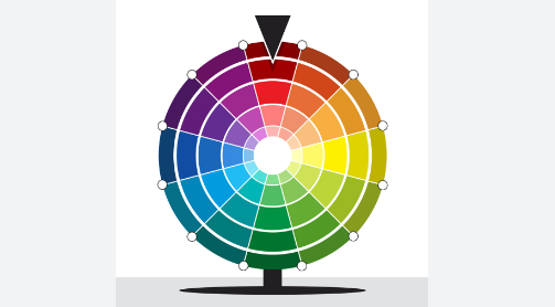
It’s time to select the other colors you’ll be utilizing once you’ve decided on a primary color. In this case, thinking about color complements is a smart place to start. Every color has a counterpart color that brings it to life; these are referred to as complementary colors.
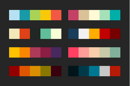
Some websites can get away with having just one color in their design. But most of the time, you’ll need at least a couple of shades to work with. You can utilize a fundamental color strategy to ensure that the colors you select blend nicely together.
The 60/30/10 rule states that secondary colors occupy roughly 30% of a website. Finding the right color scheme (monochromatic, complementary, or analogous) for the website is the first step in selecting secondary colors.
Monochromatic Color Scheme
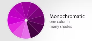
Monochromatic color schemes are those that utilize just one color. Colors like red, yellow, and green are examples of primary and secondary colors. To create a monochromatic color scheme, choose a color, like blue, then use shades, tones, and tints to produce a unified palette. Monochromatic colors check the visual appeal box but take care to ensure sufficient contrast for legibility.
Complementary Color Scheme
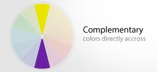
The colors in complementary color schemes are those that are at the opposing ends of the color wheel. Red and green, for instance, or blue and orange. In web design, complementary colors are frequently used since they typically contrast effectively. However, the contrast can be stunning and should be handled purposefully to avoid having the colors become overly distracting.
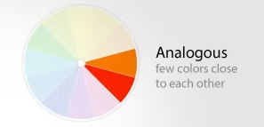
Analogous Color Scheme
The colors that make up analogous color schemes are those that are adjacent to one another on the color wheel. Although these color combinations are naturally beautiful, like monochromatic color combinations, take care to make adequate contrast for legibility. A tip for improving readability when utilizing an analogous color scheme on a website is to combine it with a neutral hue like black or white.
Color psychology may also be relevant in this situation. Bright, brilliant colors and soft, muted colors have completely distinct effects on how things look and feel. A monochromatic blue color scheme could seem restful and peaceful, whereas a blue and orange color scheme might seem fun and lively.
#3. Choose an accent color
There should be an accent color in every color scheme. Taking up around 10% of the space on a webpage, this color is utilized sparingly. Frequently, the accent color stands out sharply from the primary color. Due to the contrast, the accent color stands out and is more easily noticed, drawing emphasis to buttons and other significant page elements.
Usually, when you hear the phrase “accent color,” you think of bold colors like orange or teal. But keep in mind that black and white are also regarded as colors and can be utilized to good effect as accent colors, particularly on more colorful websites.
#4. Choosing a Background Color
The background of your website should occupy more space than any other color, in theory. However, since there are only actually two possibilities, making a decision is simple.
In order to strengthen your branding, you can use a more subdued version of your primary color. In order for the text to appear in this, the background must be either white or grey.

Alternatively, the more popular option is to have the entire website be an off-white color. It isn’t offensive and won’t prevent any content from popping off the screen, including text, photos, or links.
#5. Choosing a Typeface Color
The last step is to determine the typeface’s color. Black would seem like the obvious choice, but if you do a quick internet search, you’ll discover that it’s not as common as you might assume.
Because there is a 100% contrast between the black writing and the white background, this can strain the eyes, and consumers are more likely to leave your website if it is challenging to read.
While specifically colored typefaces need to be saved for links and significant pieces of information, you can use gray or a gray-tinted color to give your website a softer, more welcoming appearance. There isn’t much area for creativity, however, it can be worthwhile to color your font to add the perfect final touch.
Conclusion
Colors may evoke any form of feeling or action from your visitors when applied properly.
Although colors are incredibly important in web design, they are not the only element that makes a layout beautiful. The use of color theory is just but one tool among countless others that may be used to produce stunning web design.
I hope these guidelines have been helpful, but keep in mind that there are no set standards for design. The best designs, in fact, frequently defy convention. Don’t be scared to follow your creative intuition; just use color psychology as a guide.